32.7707° N, 117.2516° W
37.50499° N, 127.02893° E
32.7707° N, 117.2516° W
39.47616° N, 0.37890° W
40.41538° N, 3.70906° W
41.40395° N, 2.17382° E
39.47114° N, 0.37515° W
48.14351° N, 11.58788° E
47.31283° N, 11.38457° E
47.26792° N, 11.39058° E
48.16013° N, 11.58566° E
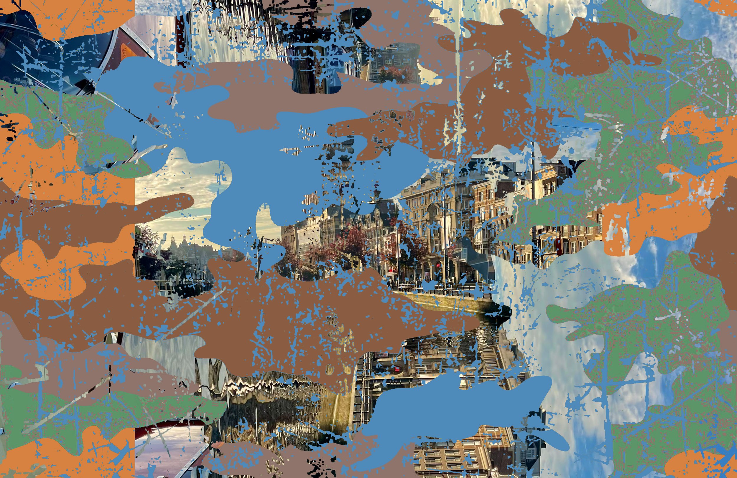
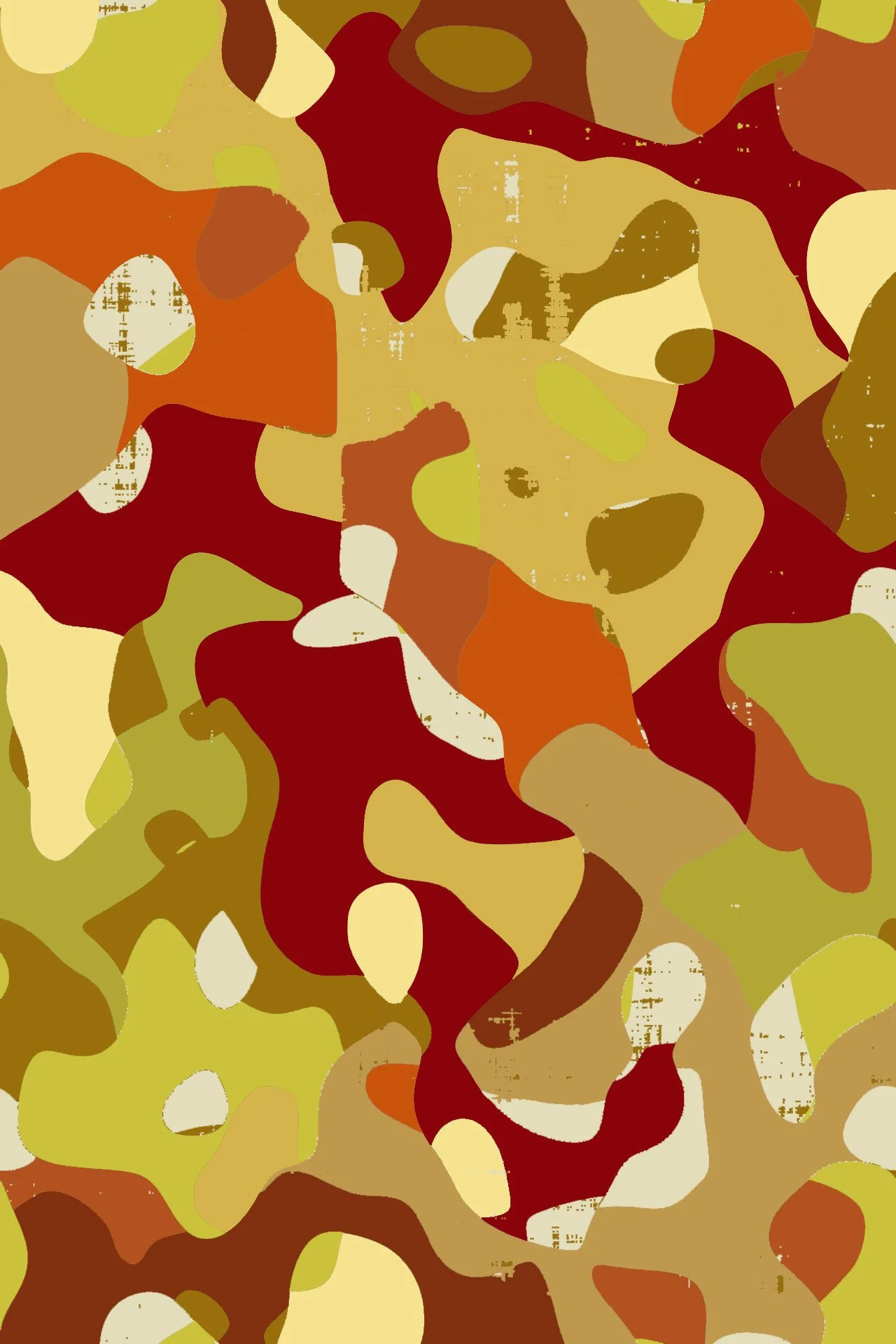
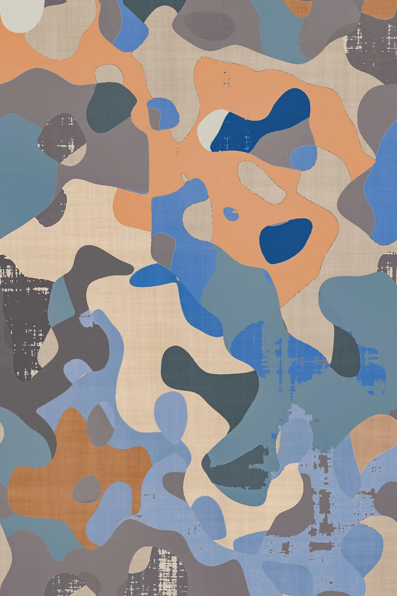
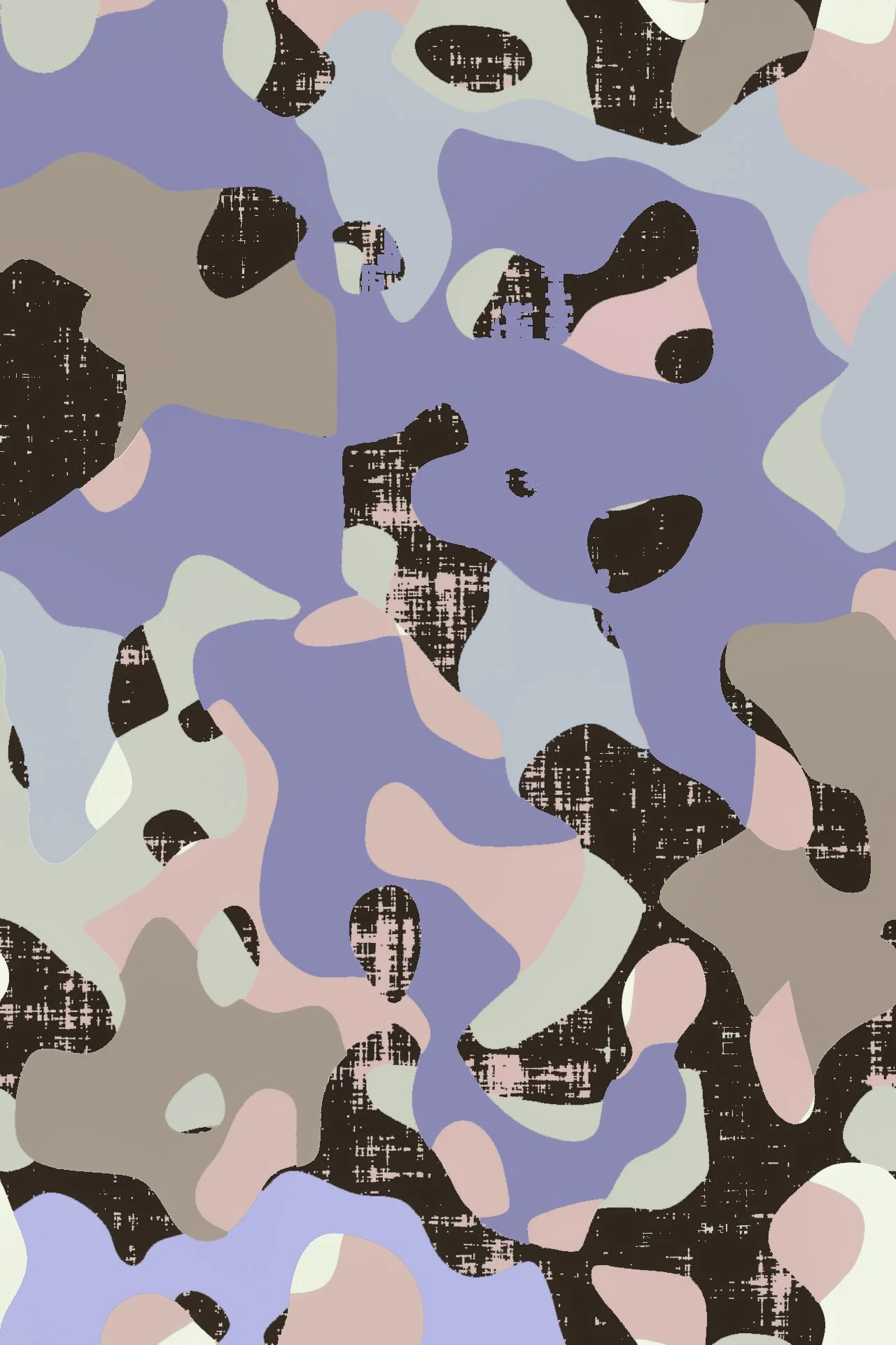
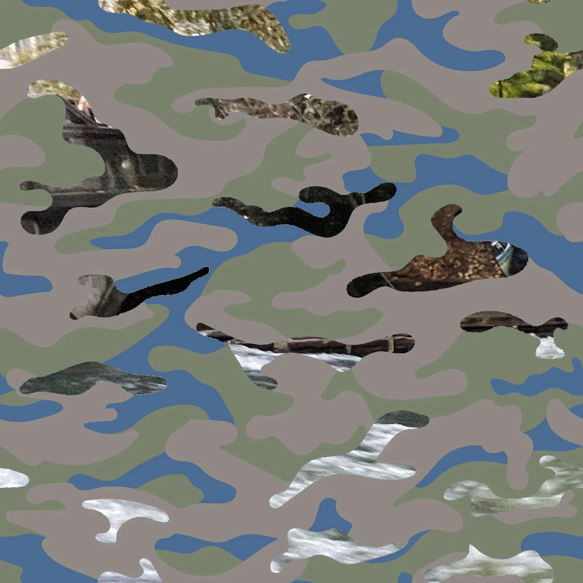
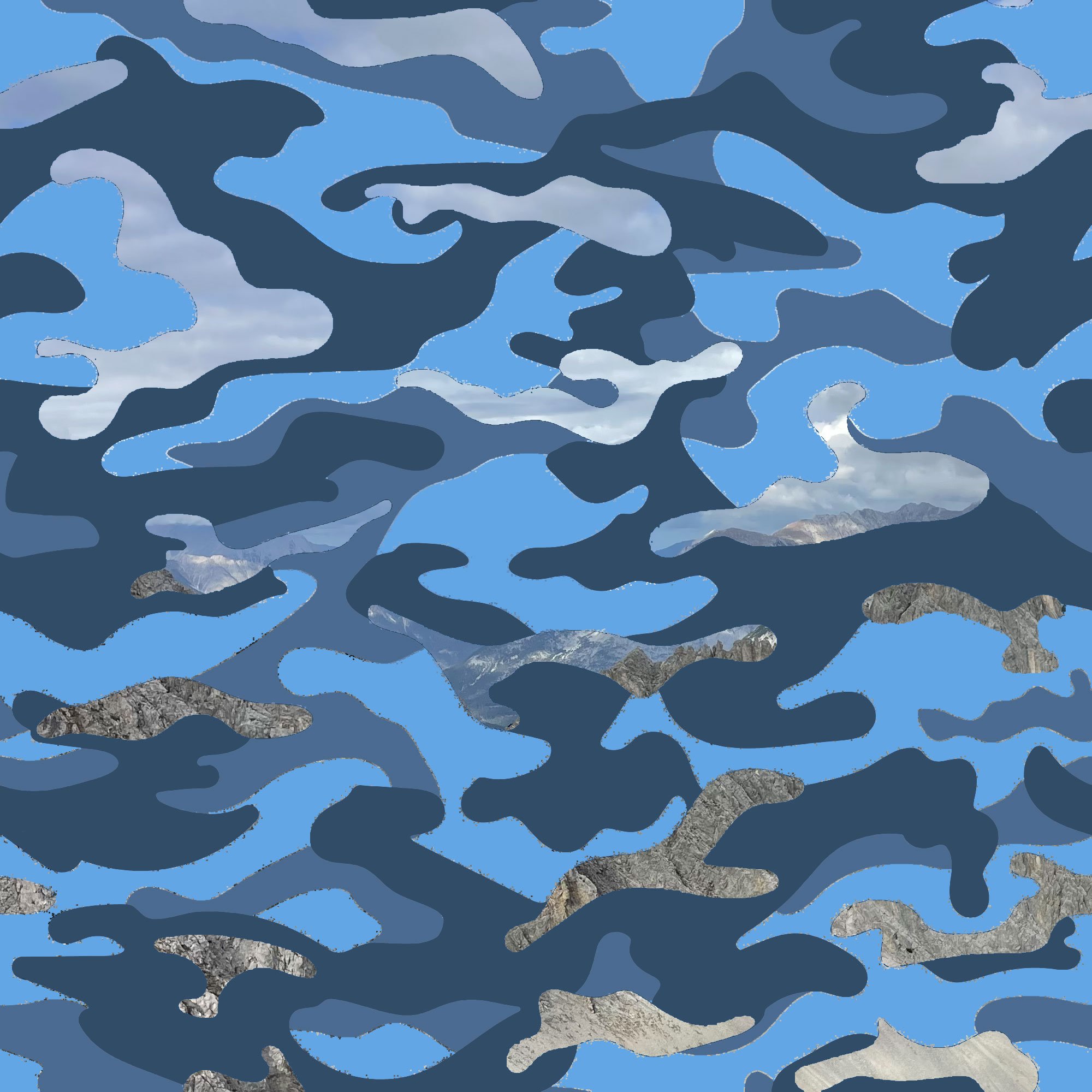
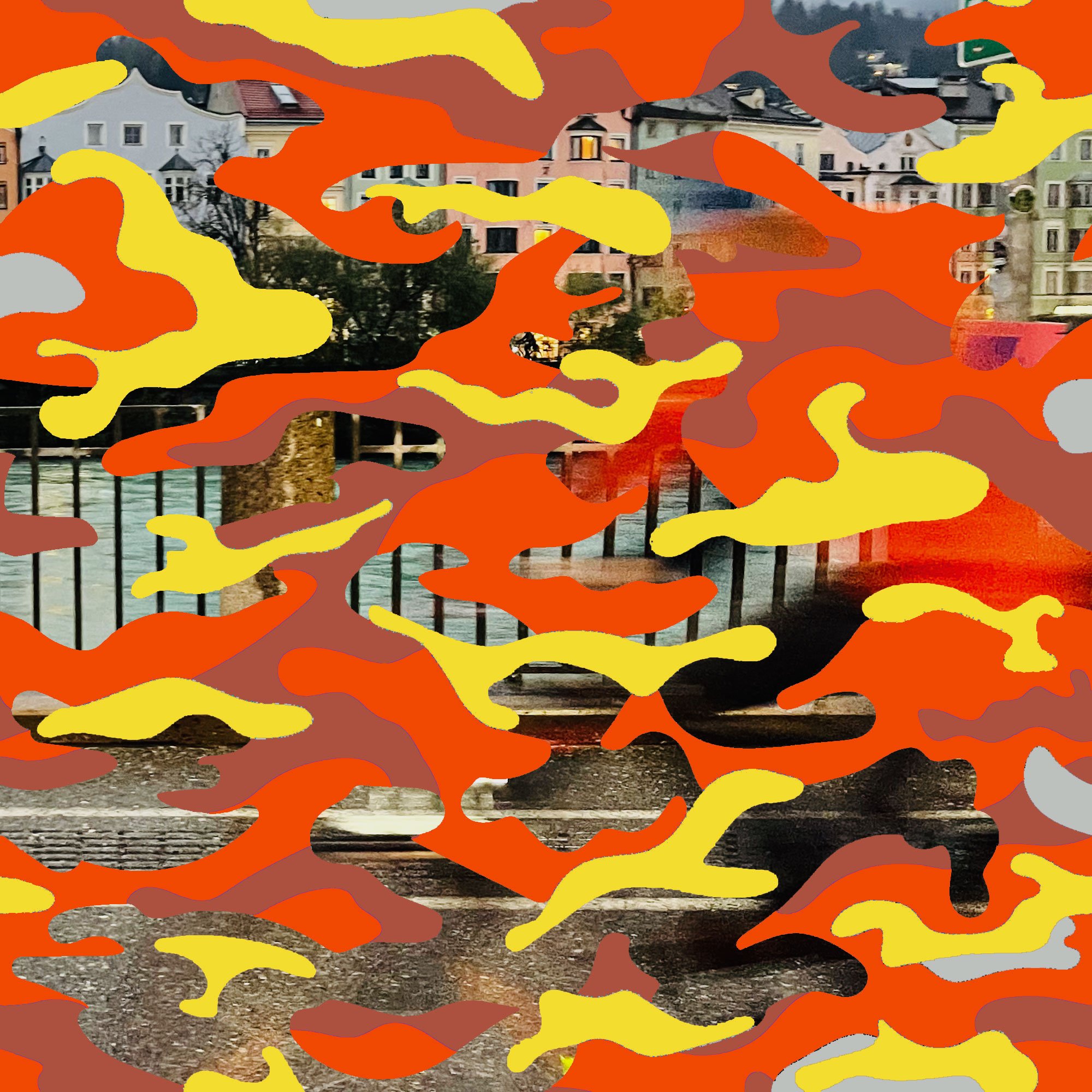
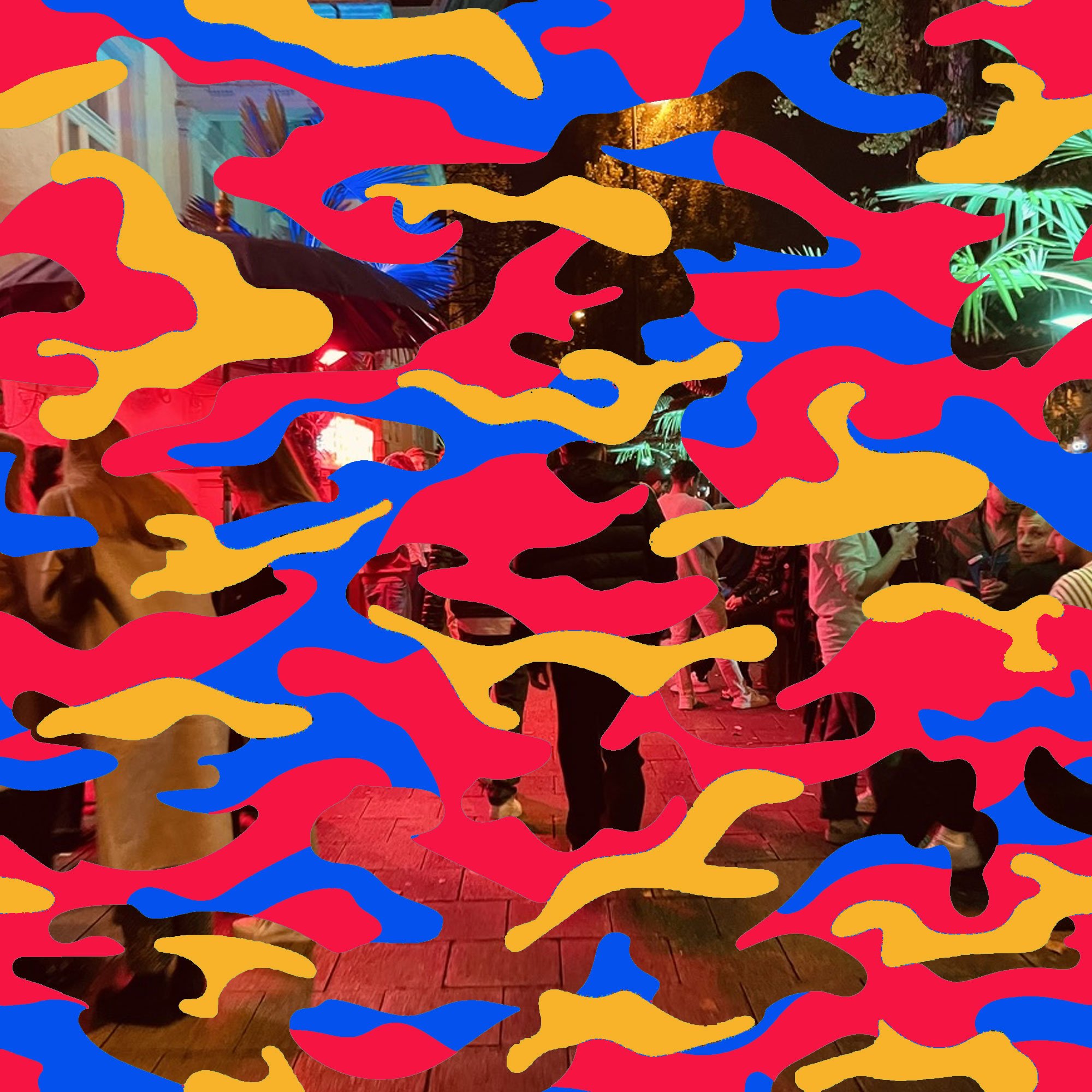
Camo
Artist Statement – Jeff Prentice
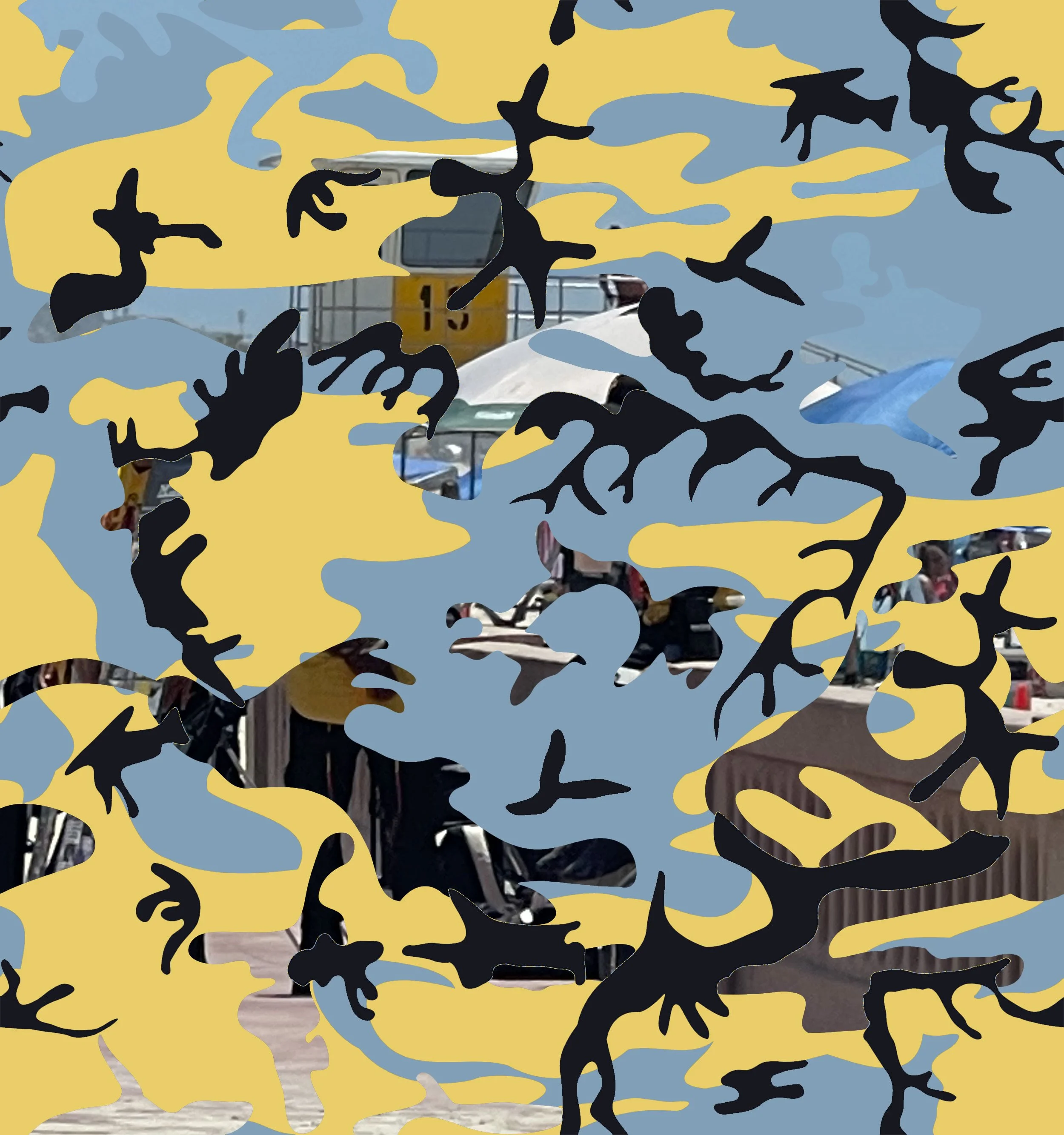
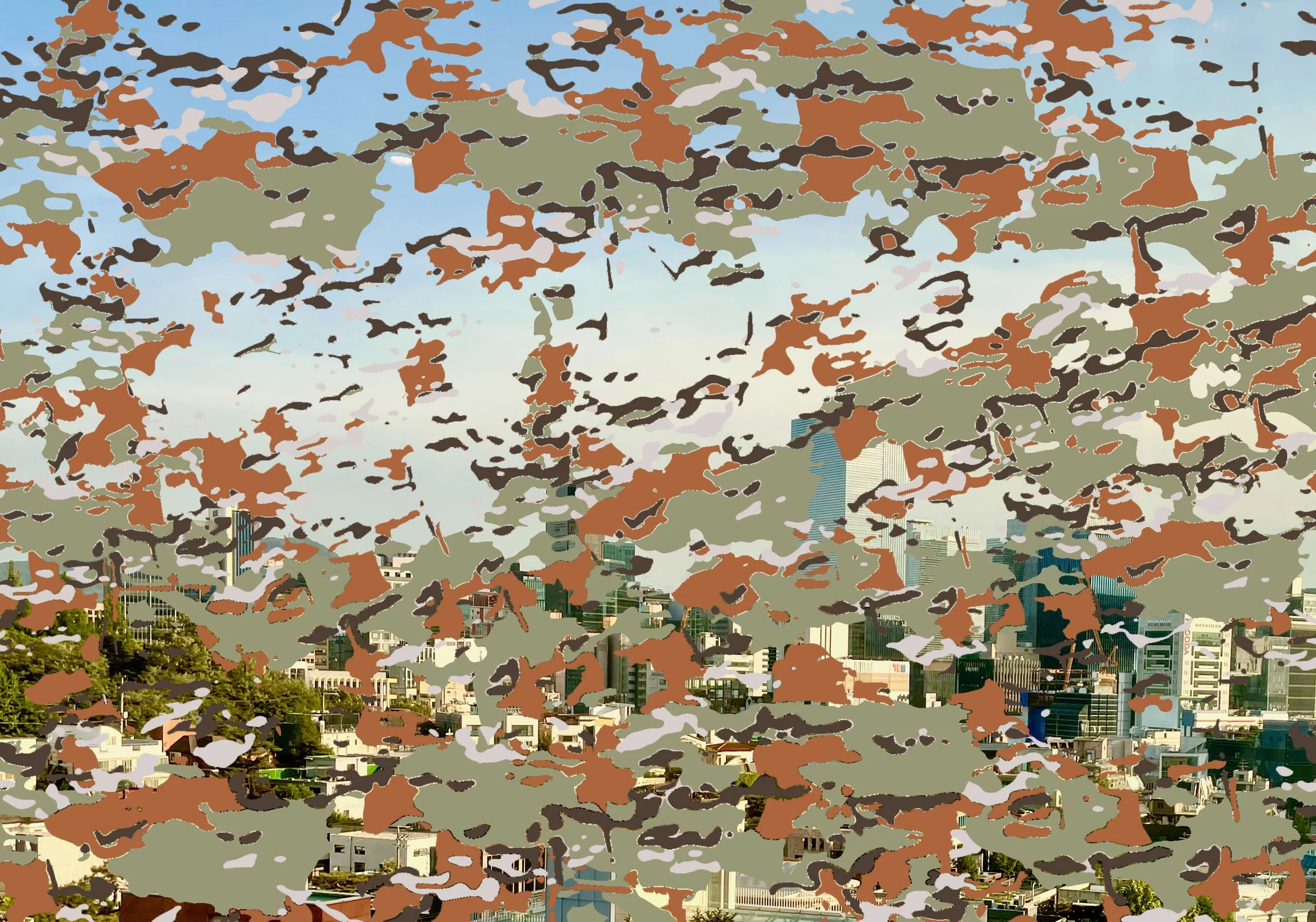
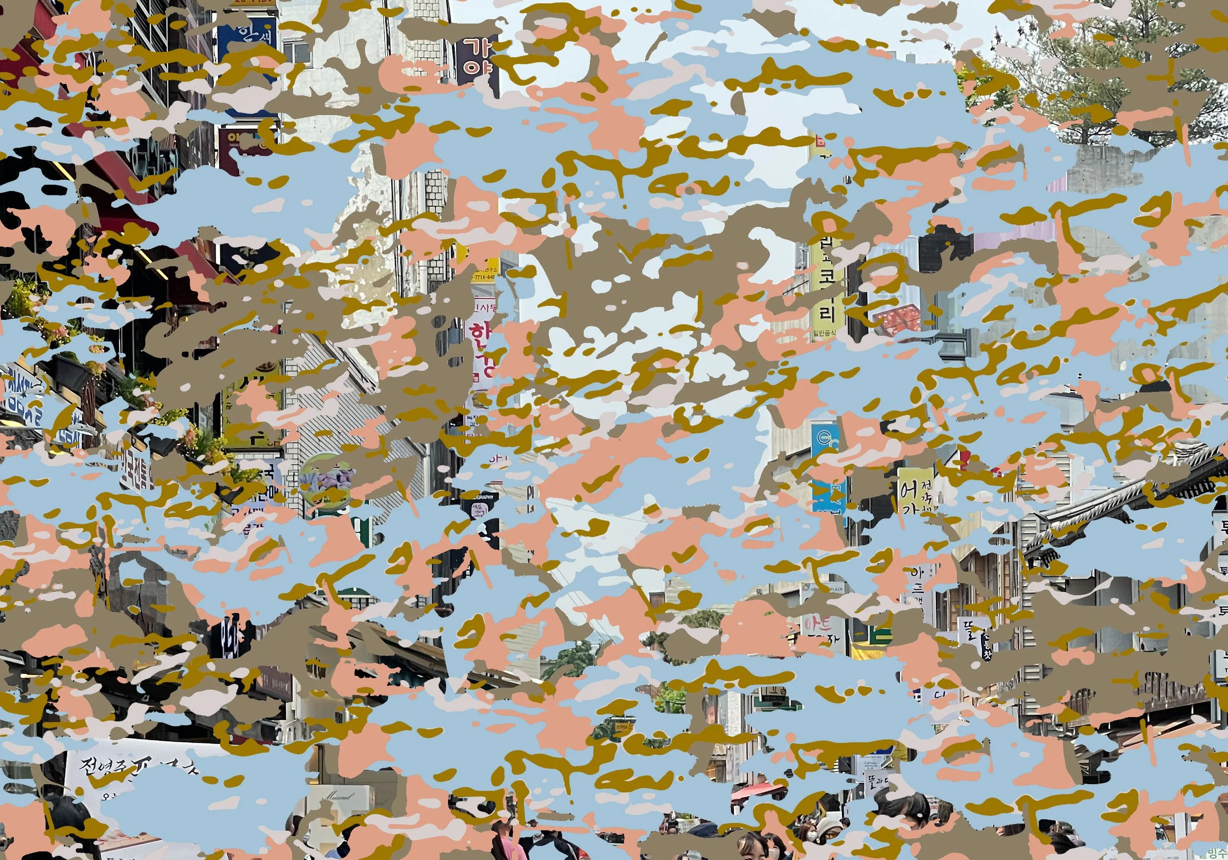
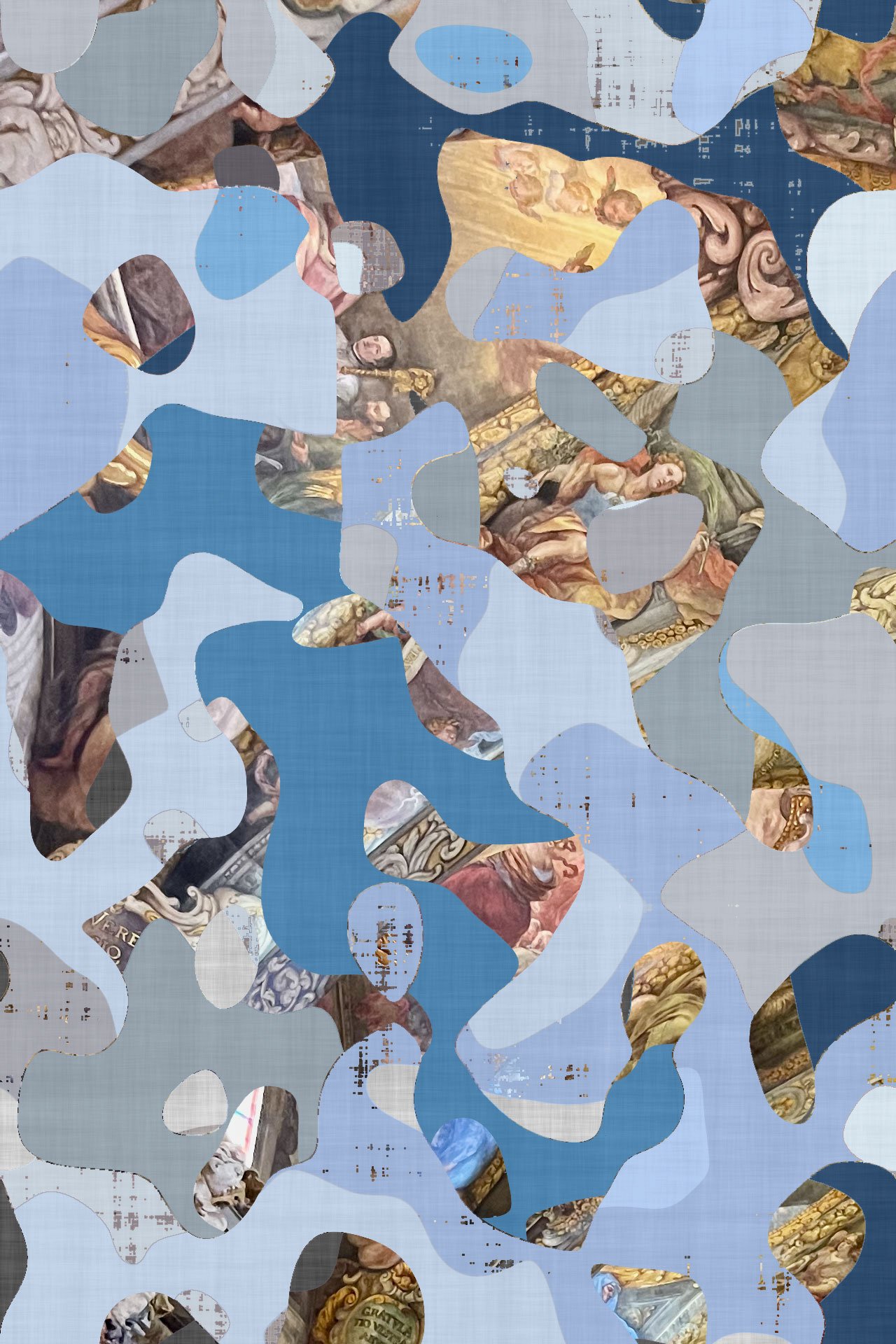
Camo grew out of my habit of noticing color—the kind that usually slips past you. Not the bright stuff up front, but the muted tones hiding in shadows, faded walls, or dry grass. I started sampling those colors with a camera and Photoshop’s color picker, pulling them from coastlines, trails, backyards—ordinary places I spend time in. Later, I added colors from older photos and trips, building a kind of archive of overlooked hues.
The idea of camouflage pulled it all together. Camo doesn’t just hide things—it translates them. It breaks the world down into repeating shapes and tones pulled straight from their surroundings. I liked that both as an image and as an idea: how we blend into a place, how it imprints on us even when we’re not paying attention.
At first, the work was purely abstract—patterns made only from color samples. Then I began slipping in small photographic fragments, pieces of the original landscape. They act like traces, reminders of where the colors came from. Each piece includes geographic coordinates, so if you’re curious, you can find the source.
Camo is about slowing down and looking again. It takes what usually sits in the background and makes it the main subject. It’s less about storytelling and more about seeing—how light, memory, and place mix together in ways we barely notice until they’re pulled apart.