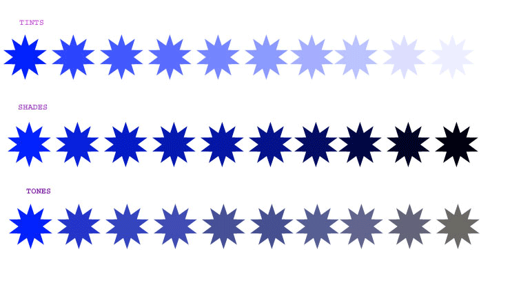
Color Theory Online 1


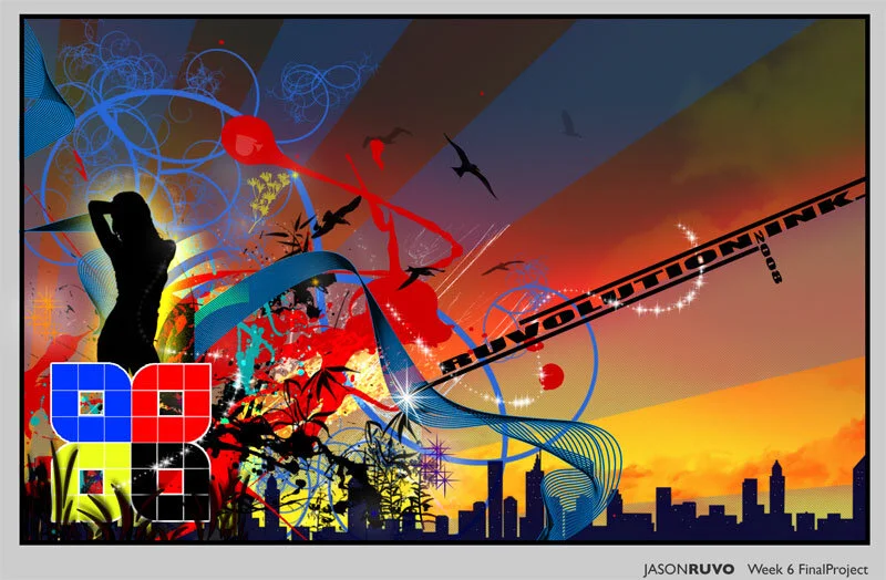
Jason Ruvo: I have added some more small details to creat some flow and interest points. The additions are rather subtle... some clouds over the city, lights on the buildings, some sparkle brushes here and there. All in all I am very pleased with the positive feedback I have received and I am content with the final product. I feel I have accomplished the goals I set out for myself in my proposal. The most important aspect for me was to create a portfolio quality piece and I think I have done it. I felt this particular color harmony was the most appropriate for my final submission as it shows extended color use instead of a simple monochromatic scheme.

Cliff Sargent: I have made a myriad of changes over the past day, and I feel that this design is as powerful and potent as my proposal implied it to be. I will speak more about the concept behind my piece in the artist statement, but for now I would like to post this early to get some feedback, just in case there is something crucial that needs to be changed. I have worked hard on this one, and I have it where I want it. The most profound change I feel was the heavily saturated red in the eye, giving the piece a focal point and adding to the aggressive nature. There was also a ton of work done with "curves" in photoshop. My color design ended up being Monochromatic, with variations on red. I experimented with several different color schemes, but for this atmosphere and emotion, as well as reading the last lecture which was very informative, I have come to the very solid conclusion that shades of red suite this far more than any other color.
Statement:
The original concept behind my design was to portray inner feelings of turmoil, immense frustration, pain, rage, and alienation. In another sense I wanted to take a look at the regression of the human state and create an image based on archaic and primal thought patterns. I wanted the photographs to have even more power than they did in their original form, and have symbolic pieces stitched together in a design that truly represented the concept I was designing around, and undoubtedly the color has added an almost electrical surge of energy to the photography, creating such an intense look that the B&W versions are not comparable. I pursued the project with this ambition of creating an antithesis to pop design, which incorporates a great deal of light hearted and friendly subject matter, and much of the time comes off as disposable, impotent, and intellectually bankrupt. Pretty harsh words, I know, but when somebody speaks of art, I think of catharsis, not catering. The design is composed for four photographs, 1 so large it takes up half the page, and the other 3 horizontally stacked upon one another. They all tie in to the above themes, the first depicts an extreme close up of a young mans faced covered in mud and paint, with an almost tribal animosity in his expression. His eyes are sullen, his hair is ragged, his lips are cracked and it is a very extreme form of expression to behold. Opposite this picture is a series of three others, starting with a wide shot of spindly trees, another extreme close up of a glowing red eye surrounded by mud and paint and finally a dirty, primitive looking hand clutching the side of a tree. The composition is balanced by the large picture on the left and the glowing red eye as a focal point on the right. Neither were adjusted so that one overpowers the other, and the eyes can easily take in the entire piece. All of the images had high contrast in relation to one another in the beginning, and after curves had been used, the contrast was even heavier, and that was the desired effect.
The monochromatic color harmony suited the piece, as red is the color wheel's answer to aggressive or passionate emotions and responses, and the various shades mixed with the content in the images intensified the organic and earth related atmosphere. The color scheme had a large part in propelling the desired effect to where I wanted it to be. The image of the fiery trees gave a much needed feeling of depth with the negative space and allows the composition to feel open and not cluttered. Finishing the final project was difficult during the end of finals, as this term was focused at the tail end when everything suddenly got extremely busy and fast paced, while it had been a leisurely trip for most of the term, but inevitably I got everything done including this, and it turned out better than I had hoped. I feel I have accomplished my stated goals, and also inspired myself to create more imagery similar to this, as my newfound love of color has opened an entirely new realm of possibilities. I feel that perhaps my overall presentation methods could be refined. I am still not used to presenting work in a professional manner, and if I can just utilize all the tools to intensify the work so that it is at its full potential when unveiled, I will be satisfied. This has been a phenomenal course. Thanks to Jeff Prentice and all my peers, I wish you luck with future endeavors. -Cliff Sargent

Chaz Head: As a Game Art and Design major, my goal for this final project was too create a design from scratch using Photo Shop as my primary tool. When i decided to create a celtic/viking pattern or knot i believed it would be interesting to me personally while fulfilling the course requirements. My main obstacle would be to find a solid color composition that would reflect something that is ancient but yet artful while respecting the culture behind such relics. Out of the 4 thumbnails rendered, i decided on the design most popular by the criticism i received and my own personal preference. Odin, the king of valhalla and lord of battle was the center piece of my idea and so i set out to create a depiction of the god not a ideal conception of his real appearance. Finished with the illustration, i am happy with the final look. I utilized tools learned in photo shop this quarter to create intricate designs and shapes and used color compositions that benefit my design. Aditionaly i decided to add a gate behind Odin representing the entrance of his realm valhalla and incorporate structures to balance and unify the piece. I encountered many obstacles rendering this piece, the most difficult of which was to make the relics look older and slightly broken down. My solution to this problem came in the form of grunge maps which are textures created from various materials like stone and concrete that can be over layed on top of your illustration to make it appear more worn and damaged. Finally, if there were anything i would like to change it would be too incorporate more color and design into the main Odin piece. It was the first object i created and lacks the more experienced finish of the rest of the piece. The goals that were set into place for this assignment i felt were met but could have been pushed further to enhance the overall image but in all i enjoyed this work greatly and believe i have gained much more experience than anticipated and hope to have similar work in the future.

Chase Stanley: I plan on creating a design an abstract design using the fundamentals of color we have learned during the duration of this course. My goal is to create a composition worthy of placing in my portfolio. I will be working with Illustrator to create this design and will be working in large resolutions, which will later be resized and submitted for my Final project. The motivation behind my design will be Burning Man. For those of you who don't know Burning Man is a gathering held in the desert just outside of Reno. It can be called many things: festive, art installation, celebration of creativity, true freedom; but the only way to truly know what Burning Man is, is to experience it. I will use many abstract shapes and colors. I envision it now with lots of organic, free-flowing elements and clashing colors; while other elements will be subtle and low key. The whole design will be created digitally and will not have photos included in the image. I see many challenges awaiting me in creating this design. First off Time will definitely be an issue. Another challenge will be creating this design in Adobe Illustrator, I am novice at best with this powerful software and overcoming this will be a feat in itself. The greatest challenge I feel I will encounter though will be creating a design which is truly representational of Burning Man. This event means a lot to me and was one of my greatest inspirations to get into photography and think more creatively. I decided to use a triadic color harmony when creating this design. I used different shades of red, blue, and yellow to convey the imagery I felt best represented my project's goals. I used cool colors to represent the calmness of the outside world. I then used warm colors to represent the craziness and explosive energy of Burning Man. As stated previously the most difficult challenge I came across in this project was creating a design I feel is representational of Burning Man. Furthermore learning Illustrator while creating the design was difficult as well. I view this design as successful, though I do feel it could be improved upon. I feel once I become more adept with the Illustrator I can create a more visually appealing design. All in all I am happy with the outcome of my project, but do realize the room available for improvement.