IMAGE ANALYSIS / Introductory assignment for Foundations
Preface
In foundation courses, it’s essential to learn how to analyze not only two-dimensional images but also three-dimensional spaces and movement. Traditional approaches often focus on Old Masters’ paintings, but today’s students benefit from a more contemporary and diverse range of material—especially those coming from different educational backgrounds.
The goal of this assignment is to give beginning artists and designers the tools to analyze visual work effectively—for themselves, for clients, for supervisors, and for teams. It’s not enough to say, “I like this.” Students need to explain why: why a composition feels balanced, why a space could benefit from more movement, or why or how a design creates visual interest and even reference historical movements that develop deep space versus shallow space, representationalism versus abstraction.
Ideally, design education begins with art and design history, examining movements such as Constructivism, traditional composition, and minimalism, while also building fluency in the elements and principles of design: line, shape, form, texture, space, and scale, in relation to balance, emphasis, pattern, unity, contrast, and movement etc.
This assignment takes a step away from the standard “describe a painting or photograph” model. Instead, students are encouraged to select at least some of their own images—materials that reflect their interests and areas of study. This approach not only increases engagement but also develops transferable analytical skills that will serve them in their chosen fields.
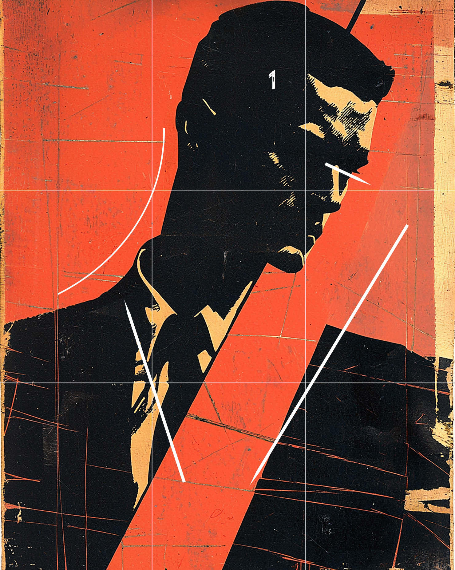
Graphic for the cover of a fashion magazine, constructivist influence. The eye comes in and immediately lands on the focal point of the face, and naturally continues on following the gaze - important to note that the gaze is one of the most important and powerful compositional tools to direct the audience through a composition. We run into that very important, vertical yellow orange shape on the border and bounce off and go down the red corridor, and then back up the tie and the shirt and then peruse along the curve of the neck line and back to repeat. Very strong negative space in both shape and form and color that fluctuates. The space/depth itself is shallow. Reminiscent of a Jim Dine print.

While the initial response might be to label this symmetrical, it is actually an example of approximate symmetry since there are elements in the rooms that are not mirror images. Unity is created through neutral earth tones. Contrast is created through the texture on the wall as opposed to the smooth finish of the floor. The even balance and approximate symmetry presentation imbues a feeling of serenity and stability appropriate for a bedroom in this style. The photograph takes advantage of the rule of thirds by placing the baseline on the lower rule of thirds horizontal line in order to accentuate the upper 2/3 of the composition. The primary focal point would be the bed and then depending on the viewer I would say the cloth covered table in the lower right corner would be secondary and then the related table in the left corner of the room, tertiary. The importance of the exterior as it relates to the interior cannot be underscored enough. Symmetry is a mirror image. Even the slightest deviation such as different plants on the outside, add an immediate component of imbalance and eccentricity and completely change up the experience, adding an element of richness and visual interest while maintaining the peaceful balance and stability of the room.

In this composition, the main character isn’t placed directly on the rule of thirds. This is a good reminder that the rule is just a guideline, not something that must always be followed. By placing the character slightly off-center, the artist creates asymmetry. This opens up negative space on the right side, giving the composition a sense of movement and depth, even though the background itself is relatively flat. The gaze of the character is very important. The eyes look directly at us, which confronts the viewer and breaks the “fourth wall.” This instantly creates a connection. From there, our eyes naturally follow the diagonal line of the sword. Notice that the sword avoids pointing into the corner—this keeps the composition active instead of locked into a stiff “X” shape. The diagonals continue through the arm, the shoulder, and up into the ponytail, giving us a smooth visual path that eventually leads back into the space behind the figure. If this piece were symmetrical, it would feel more static, like a statue. Instead, the asymmetry makes it dynamic and full of energy, suggesting that the character is ready for action and that a story is about to unfold. Unity comes from the warm colors used throughout the figure, while contrast comes from the dark shadows and the strong red-and-black combination—a dramatic and modern effect. Finally, the contrast between the curving shapes of the figure and the rectangular shapes in the background adds visual richness and keeps the viewer engaged.

This AI-generated game environment shows some interesting compositional choices. The horizon line is placed along the lower third, which emphasizes the upper two-thirds of the image. However, the main character is centered. It would be stronger IMO if placed on a rule-of-thirds intersection, since that usually makes a composition more active. Even so, the small size of the figure works well as a focal point. Small focal points can be surprisingly powerful because they draw the viewer in and feel more intriguing. The environment adds energy to the composition. Diagonals in the foreground contrast with verticals, and the edges of the image suggest space beyond the frame instead of containing everything inside a box. Warm colors appear on the right, cools on the left, with geometric forms balancing against more organic shapes. Atmospheric perspective also plays a role: the foggy mountain and bright blue sky in the background guide the eye back into space, which is an important skill for beginning students to practice. Overall, the composition combines depth, contrast, and a small but effective focal point—even if the rule of thirds isn’t applied perfectly.

This is a strong example of the rule of thirds. The horizon line is placed along the upper third, which emphasizes the lower two-thirds of the composition—the area where the viewer spends most of their attention. The largest boat, which serves as the focal point, is also near a rule-of-thirds intersection, creating balance, movement, and structure. Interestingly, the mountains could also be read as the primary focal point, since the eye is drawn to them first before settling on the boat. This layered attention makes the composition more engaging. There is excellent use of diagonals: the outrigger leads to the diagonal of the concrete waterfront, which then leads up to the power pole. The angled support on the pole brings the viewer’s eye back into the composition rather than out of the frame. This is a perfect demonstration of how using the rule-of-thirds grid on your camera can help create dynamic photographs. Atmospheric perspective is also at work. Notice how the mountain on the far right appears lighter than the rest—this creates the illusion of depth in a two-dimensional format, a strategy you can use in both abstract and representational work. Finally, the clouds act as a slowing mechanism, holding the eye within the composition instead of letting it sweep off the top of the mountains. Even small details—like the dark patch in the lower left corner that breaks up the concrete—add complexity and provide anchor points for visual interest.
Stacked Boxes
Negative space
Subdivided, foreground floor (fg)and background(bg) Gradient in background creates a volumetric space contributes to mood.
The shape of the negative space surrounding the boxes, the notches, the small openings under each box creates visual interest.
Contrast The horizontality of the wood floor contrasts with the verticality of the boxes. The vertical locks/handles contrast with the horizontal boxes
Texture on floor emphasizes foreground
Color
Warm floor, cool background
Boxes are a mix of warms (oranges and yellows)
and cools, blues and blue grays
The green and beige act as intermediaries, glue, compositional binders
Perspective. 2 pt. Creates depth, deeper space. Volume. Form.
Repetition of the boxes creates rhythm and unity
Summary. Visual interest is created through the use of contrasting warms and cools, a variety of textures, the use of typography, and the development of a minimal yet evocative realistic studio or gallery space. The boxes have a sense of antiqued beauty, mystery, aged through travel or shipping. It’s intended to work as sculpture, not an image we might encounter in a warehouse.
Girl in a Cap
Negative space
Shallow. Textured, starting with vertical blurred lines at bottom changing to broken gridlike elements. Soft gray, low contrast, sharply delineated interesting contours around the cap leading to a blurry softness from the shoulders on down.
Contrast
Wide range of values, from the charcoal blacks under the cap to the whites around the nose, and a fell spectrum of midtones. Classic upper left light source creates a sense of volume and highlights the shapes of the face, the lips, the eyes.
The dark lips due to their dark against light contrast are almost as strong as the eyes for focal points.
The wavey hair contrasts with the sharpness of the collar, uniform?
The vertical background stripes are broken by perpendicular folds in the material.
We are confronted by the gaze.There is no voyeurism here. Mugshot? Photobooth?
Repetition The roundness of the buttons, the eyes.
Summary
An ambiguous portrait, the mood is worker class, but the make up, the pose, could be modeling for a brand of clothing here. The confrontational yet expressionless gaze, the flatness and closeness of the space, for me it has a certain timeless beauty, soft shapes and arms length intimacy, has an album cover feel, magazine material.
Poster
Negative space
Great example of how the negative space here is as important and as interesting as the positive forms. The blue diagonal thrusting down from the upper left donw into the pink structure. Movement, contrast.
Contrast
Cool against warms. Rounded structures against angular
Repetition
The grid of glasswork towards the lower right. The chairs.
Space
The perspective of the building starting from the right angles down to a point directing us to the land far in the distance. Both scale and value are used to create distance and depth here.
Composition
The text upper left acts as a visual brake, keeping our eye from leaving the space following the line of pink angling up and out.
Scale
The huge pink structure just has so much presence, looming over the comparatively tiny mirrored chairs below. Note how effective the use of scale is here, with the architecture dwarfing the much larger land mass farther out to sea.
poster for an interior design and architecture design conference showcasing color trends in 2024 --ar 4:5 --q 2 --q 2 --s 750
solitary man
Negative space The nuetral/warm sky is subdivided and filled with darker cloud forms, the foreground structures create puzzle piece cutouts against it, keeps the eye engaged.
Rule of Thirds One could argue that the upper 2/3s of the composition is emphasized due to the lower HL.
Depth Overlapping and diminishing sized structures, lighter values as the eye goes back, so yes, we go way back here.
Repetition There is repetition in the tile grid creating a pattern, percussive read, with an interesting overlay of reflection.
The Gaze / Eyeline Probably one the biggest contributing factors in the creation of depth here is the eyeline that we don't even see. We know Solitary Man is looking out in the distance, and we can’t help but follow his gaze to see what it is he is looking at.
Do we need the floating spheres? Ai garbage. It could be argued they create a midground buffer that slows our gaze down as we look far, far out onto the cityscape.
Symmetry This isn't symmetrical, but it is approximate symmetry. Being centered, static, contributes to the mood of contemplation and isolation. We don't want movement and dynamic imbalance here. It’s a nailed down gaze outword, he’s a totem, a symbol, an icon.
Prompt composition utilizing the rule of thirds as a guide for placement of a focal point for a design course graphic novel style Steve Dillon --ar 16:9 --s 750
Modern Minimalism w Japanese Influences
Negative space Open, with large expanses of textured wall, polished floor, floor to ceilign blinds
Contrast Low contrast on purpose,relaxing,a sleep area.There is contrast between the textured wall and the rest of the room. There are contrasting lines; the vertical blinds / paneling on ceiling and wall.
Repetition Symmetry: Lamps, blinds, and in the corners some kind of covered element? We also see the wood repeated in the ceiling, walls, tables, and bed - These are material repetitions, not shape.
Unity through color and materials.
Mood through symmetry open space.
Summary
The natural elements, wood, textures, the open space, the light, uncluttered and balanced…This is the definition of luxery
There is good use of repetion of geometric form with the bed, door/windows, tables, pillows…The large textural wall enhances without being overbearing. As far as scale, some people might want a more intimate space.
Prompt interior design, master bedroom, applying the principle of Value, Texture and the principles of Pattern, Repetition, and Rhythm, sustainable materials, old timber, raw concrete, whitewashed lime, Spanish estancia style mixed with modern minimalism and Japanese influences, pro lighting, super photorealistic --ar 16:9 --q 2 --chaos 100 --q 2 --s 1000 --q 2 --s 750